“`html
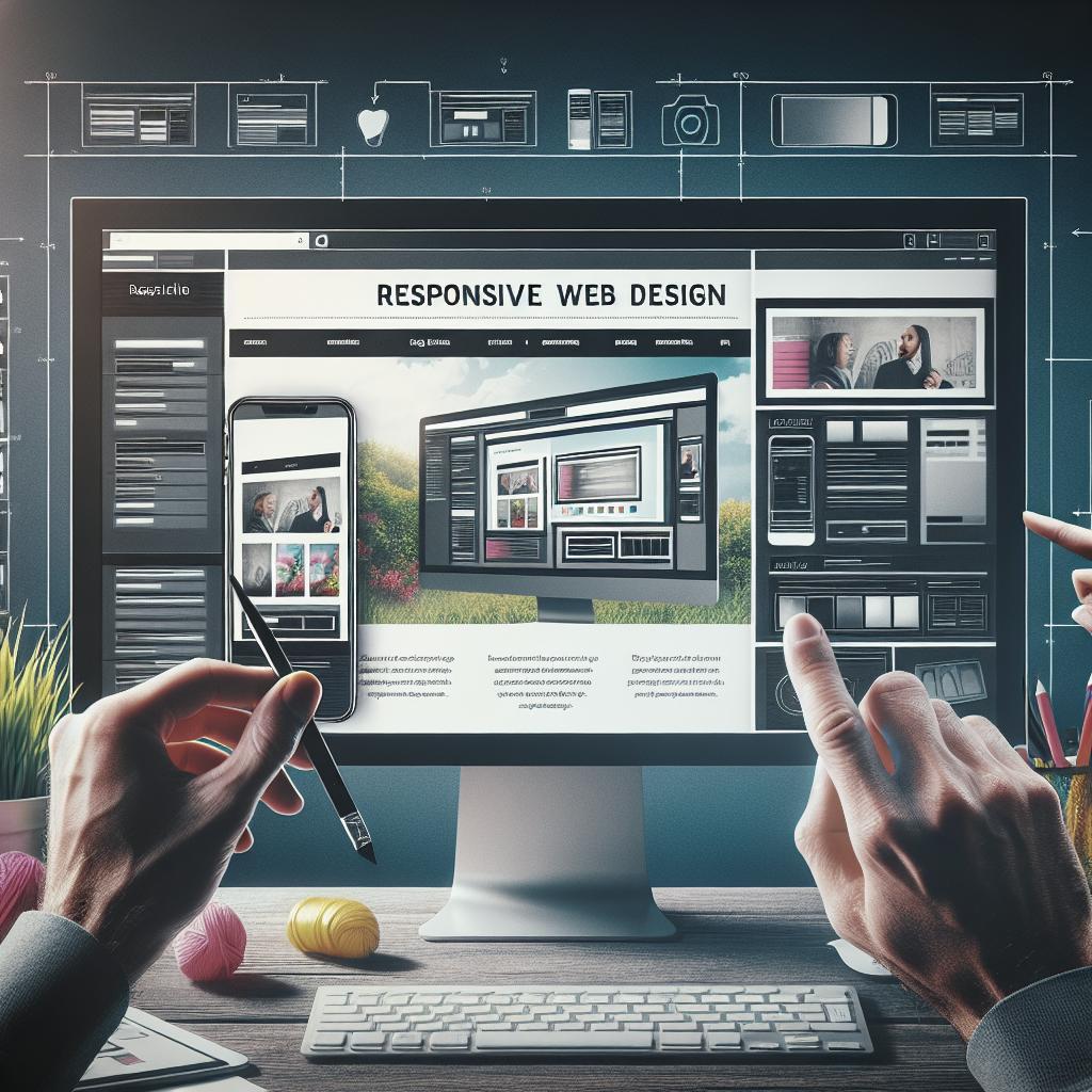
How to Create a Responsive Web Design
In the ever-evolving digital world, having a responsive web design is no longer a luxury but a necessity. With audiences accessing your content from a variety of devices and screen sizes, creating a responsive design ensures that your website functions beautifully everywhere. This blog post delves into the significance and application of responsive design, introducing key concepts such as media queries and responsive images, as well as powerful layout technologies including Flexbox and CSS Grid. Additionally, we’ll explore techniques for optimizing typography for various screens and discuss the importance of the viewport meta tag. Whether you’re starting from scratch or looking to enhance an existing site, understanding these fundamental principles will guide you in creating a versatile and user-friendly web presence.
Precursor to responsive design: mobile web design
Before responsive design gained prominence, web developers focused on creating mobile-specific websites. These websites were often separate from their desktop counterparts, with different URLs and tailored content suited for mobile screens. While this method provided a solution, it was limited and inefficient as it required maintaining multiple codebases. Additionally, it did not accommodate the variety of device sizes that emerged with the proliferation of smartphones and tablets.
Mobile web design’s limitations highlighted the need for a more fluid approach that could seamlessly adjust to any screen size. This led to the foundational concept of responsive design, which allows a single codebase to adapt to various devices, creating a consistent user experience without the need for multiple versions of a site.
Introducing responsive web design
Responsive web design revolutionized the way developers approach website creation. Coined by Ethan Marcotte in 2010, it introduced a methodology where design and development respond to user behavior and environment based on screen size, platform, and orientation. The core idea is to craft sites that provide an optimal viewing experience across a wide range of devices.
By incorporating flexible grids, layouts, media queries, and a fluid grid concept, responsive design eliminates the constraints of device-specific versions. This holistic approach not only enhances usability but also streamlines maintenance, ensuring that any changes made are automatically reflected across all platforms.
Media Queries
Media queries are a cornerstone of responsive web design. They enable developers to apply specific styles to different devices based on properties such as screen width, height, resolution, and orientation. By using media queries, you can tailor elements of your website—like navigation, typography, and image scale—to dynamically shift depending on the screen size.
Media queries are executed using the `@media` rule in CSS, allowing flexibility in design adjustments. For example, you can set different font sizes or layouts for screens smaller or larger than a particular breakpoint, making your design adaptable to any environment a user might prefer.
Responsive layout technologies
Multicol
The multicolumn layout, or multicol, allows content to be easily divided into columns, reminiscent of newspapers or magazines. This method is advantageous for textual content, ensuring readability and a neat presentation for large blocks of text across different screen sizes. While multicol has its place in design, it is often used less frequently in favor of more robust solutions like Flexbox and Grid.
Despite being overshadowed, multicol still offers simplicity and ease of use for specific applications, such as wrapping text efficiently and adjusting column gaps without extensive code.
Flexbox
Flexbox is a versatile layout model that provides a more efficient way to arrange and align elements within a container, even when their dimensions are unknown or dynamic. It excels at one-dimensional layouts, aligning items vertically or horizontally. Flexbox is particularly useful for building responsive navigation bars, footers, and complex grids where items need to adjust smoothly as the viewport changes.
The power of Flexbox lies in its ability to distribute space within a container and automatically adjust item proportions. This adaptability makes it easier to design consistent and predictable layouts that respond harmoniously to various display sizes.
CSS grid
CSS Grid Layout, or simply Grid, is a robust 2-dimensional layout system that affords more complex designs and greater control over layout alignment and hierarchy than previous methodologies. Grid provides properties for creating grid items within grid containers, allowing for precise positioning and resizing, which is particularly useful for creating page-specific layouts.
Grid can be combined with other layout strategies like Flexbox to maximize design flexibility. With features like auto-placement and area templates, Grid enables developers to produce intricate and highly responsive designs that fit various screens without sacrificing aesthetic quality.
Responsive images/media
Images and media are essential components of web design, and ensuring they scale correctly is critical for a responsive design. The `srcset` attribute and `
Embedding responsive media, such as videos, can also be managed through CSS properties like `max-width: 100%`, ensuring that media adjusts within its containing element without overflow, maintaining aspect ratios and delivering a seamless viewing experience across devices.
Responsive typography
Using media queries for responsive typography
Responsive typography involves adjusting font sizes and line heights to improve legibility across devices. Media queries can target various screen sizes and apply distinct font styles accordingly. For instance, larger text might be necessary for smaller screens to account for readability, while desktops can opt for finer typographic details.
Using media queries strategically ensures typography not only looks good but is functional and accessible, enhancing the overall user experience on variable formats.
Using viewport units for responsive typography
Viewport units, such as `vw` (viewport width), `vh` (viewport height), and `vmin`/`vmax`, offer a dynamic way to resize text based on the window’s dimensions. This approach allows text to scale proportionally with the viewport, supporting a fluid and adaptable design.
This method simplifies responsive typography as it reduces or even eliminates the need for media queries, providing a more scalable solution that can accommodate any screen size changes naturally and effectively.
The viewport meta tag
The viewport meta tag instructs browsers on how to control a page’s dimensions and scaling. For mobile-friendly responsive design, it is crucial to set this meta tag correctly to ensure that layouts render properly on all devices. Common settings include specifying the width as the device-width and setting the initial-scale to 1.0.
This simple yet critical step allows your designs to function as intended on various devices, avoiding common pitfalls like horizontal scrolling and zooming issues that detract from user experience.
Summary
The modern digital landscape requires that web designs be flexible, adaptable, and user-friendly across an array of devices and screen sizes. Techniques like media queries, responsive images, and advanced layout models (such as Flexbox and CSS Grid) are essential for crafting these versatile designs.
Furthermore, typography and media scale seamlessly through responsive units and media queries, while the viewport meta tag ensures correct rendering across devices. By embracing these principles, developers can build websites that not only look great on every screen but also provide an excellent user experience.
See also
- Responsive Design on MDN Web Docs
- W3Schools: Responsive Web Design
- A Guide to Flexbox
- A Complete Guide to Grid
Final thoughts
| Topic | Key Concepts |
|---|---|
| Mobile Web Design | Separate mobile sites, limitations on design for multiple devices |
| Responsive Web Design | Flexible layouts for consistency across devices |
| Media Queries | Applying specific styles based on device properties |
| Responsive Layout Technologies | Multicol, Flexbox, CSS Grid |
| Responsive Images/Media | Srcset attribute, picture element |
| Responsive Typography | Media queries, viewport units |
| Viewport Meta Tag | Essential for correct page rendering on mobile devices |
“`